
I like this fashion illustration as it is unique using collage techniques. They have cut out interesting detail from dresses in magazines and stuck it over their illustration to play around with different sillhouettes and designs.
I like this fashion illustration as it is unique using collage techniques. They have cut out interesting detail from dresses in magazines and stuck it over their illustration to play around with different sillhouettes and designs.
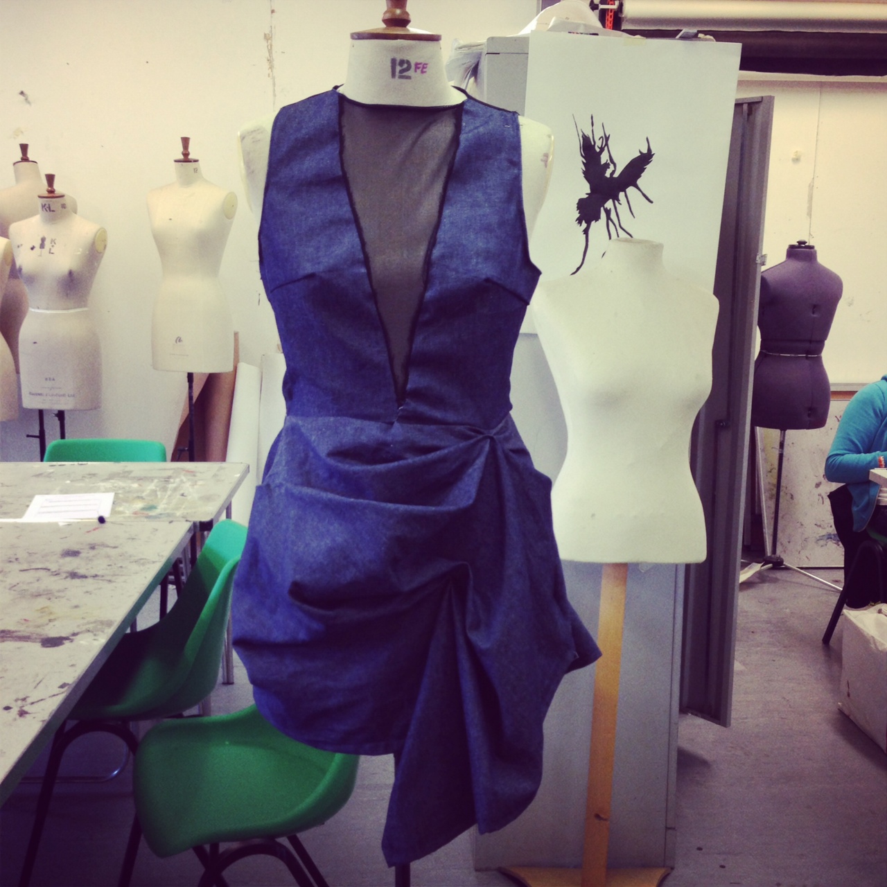
For our denim project we had to research into the history of denim, who wore denim and research into a fashion designer that relates to our theme. We then had to use this research to create our own spring/ summer … Continue reading
http://bellalorain.wordpress.com/
For our project over the christmas holidays we had to study one of three postcodes in London and use our research from that postcode to style our own photoshoot. I worked with my friend Ellie and we studied W1 postcode which is mayfair area; we got our inspiration from the history of mayfair, the architecture, the people we interviewed and what people used to wear and what people wear now. We then put our pictures from our photoshoot on our ‘styling company’s’ blog (on the link above). We used Amy as our model and Sophie as our photographer and me and Ellie as makeup artists and stylists.
Here are some examples from our shoot:


This is my finished peice which I made at the end of my project. I think it turned out quite well in terms of my print and how the colours looked together. However I found the making of the garment … Continue reading
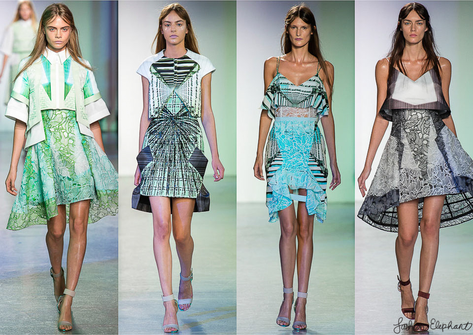
I also came across Peter Pilotto’s spring/ summer ’14 collection whilst I was in London and his collection really drawed me in. I love the unusual tailored shaped garments the graphic prints and the pastel colours (which is big this … Continue reading
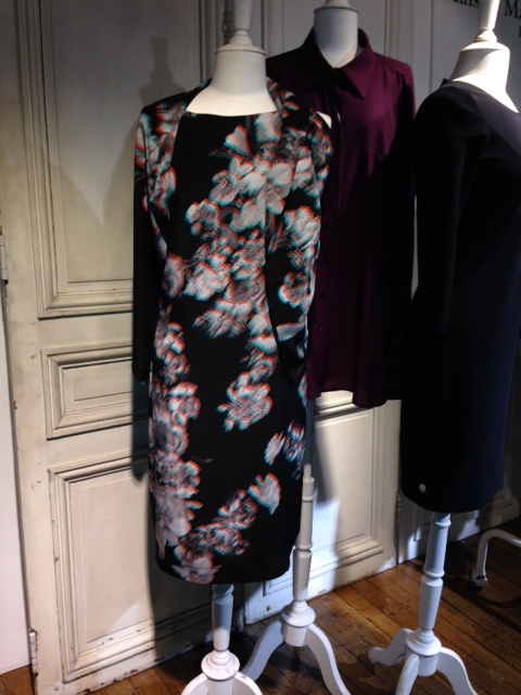
I went into Liberties when I was in London the other day and was looking at the designer section. I came across this dress with a 3D effect, which I had never seen before and I thought it was really … Continue reading
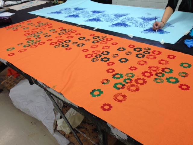
This week I learnt how to screen print which was fun. I did several experiments using different colours, types of material and ways of printing my design; whether it was repetitive pattern or reflective. Once I bought the material I wanted to use and decided what colours I wanted to have my design in, I started making my final piece.
I layed out the fabric I bought and mixed colours together to get the colours I wanted then started printing. I placed my screen in the top right corner of my fabric, spreaded red, green then more red at the top of my screen and used the squeegee to do 5 drags (I learnt that 5 drags made the print come out more effectively on my fabric. I lifted up my screen to see my pattern come through well, then reflected my design on my next print. I then repeated this until I got all the way across my fabric.
Every 3 prints I washed my screen before it got blocked. One of my prints did not come out so well, possibly because the paint dryed up and blocked part of my screen because it was left too long without washing. To fix this problem I got a small paintbrush and handpainted over the parts of the print that did not come out as well.

Since it took me so long to do a whole row of printing and I did not have much time left; instead of doing a second row and rushing, I decided to just do two prints below to create a fading look.
When I finished printing I went over some of my pattern with a thin paintbrush that I thought needed touching up. I then cut off the leftover fabric and ironed my pattern so it stayed nice and is safe to wash.

Overall I am really pleased with the outcome. I love the bright African inspired colours I used and I love the effect of the bright green going to dark green then back to bright. I also love the fading effect as it may have looked too much otherwise, and the negative space is effective.

Last week I went to Venice to look at the art and get inspiration. I saw lots of amazing art and had a really good time! Venice is one of the most beautiful places I have ever been to, with the old buildings, pretty temples and cathedrals and the canal going around and through Venice. We had to travel from place to place in Venice via boat which was nice as you got to see all the pretty buildings.
On the first two days we visited the Bienale art gallery, which had the most amazing art work but also the wierdest art work I have ever seen.

I came across this piece which reminded me of my design idea for my pattern. This is because of the shapes and how abstract it looks. I like the shapes they have used together, the overlapping and the layers. I also liked how symmetrical his pieces were.

I also saw this drawing of some sort of animal but the fact I could not tell what animal this is meant to be interested me. This links to the project I am doing at the moment as we had to make our own beasties up, and this is clearly what this artist has done on his work.

The artist who made this collection of models has also clearly made up his own beasty. This dragon reminded me of a mythical creature; I like the long curly nose which looks like an elephants trunk and the scale body which could be from a fish, and the spikey back. I love the amount of detail he put into his models; he also made several models of insects which is also what I am studying at the moment.

In the whole bienale gallery this collection of paintings had to be my favorite. I love how the bright colours draw your attention and how they contrast together. I also love the interesting shapes and how you have to look closely to find strange creatures painted within the contrast of colours. I cant make out what creature this painting is meant to be but it looks spikey and has lots of legs. It reminds me of the centipedes I am studying at the moment. This collection inspired me to use bright colours in my final design.

On one day I went on a boat which was the coolest boat I have ever seen! The walls and ceilings were all made from crochet and different textiles. There was material draping down and lights everywhere. It was one of the most beautiful and original art works I have ever seen.


We visited Moreno on our last day there to have a look at the glass they are famous for. We watched how they made glass sculptures which was amazing. They used a long stick, a very hot fire and the blowing technique to make the glass at the end of the stick. They used plyers to shape the glass into a horse, and it was amazing how they managed to create such detail and accuracy with just a pair of plyers. It literally took them 5 minutes for them to make! We then visited a glass gallery which had the most beautiful and extravagant glass.
Overall I had an amazing week and it has helped me get a lot of inspiration.
This week we had to bring in our own inglorious beastie to uni so I decided to bring in a centipede as I thought the shapes and patterns would be interesting to draw.

I did a variety of pencil drawings of my beastie in my sketchbook from different angles and experimenting with different scales. I then started doing bigger sketches of my beastie on cartilage paper (above) with different size black fine liners to show the think and thick lines. I used a variety of techniques such as line drawing, drawing without looking at the paper, drawing from memory, negative drawing, drawing from how we imagine the texture to feel, then simplifying the texture to a pattern. I got some interesting outcomes from this and I decided to add some water to parts of my centipedes to smudge the lines slightly to give a nice shadowy effect.

On drawing day two, we had to create our own made up beasties by cutting out parts of animals and sticking them together. For example I made a ‘two headed bulload’ which was a toad with two bull heads which I think looked interesting and it reminded me of a mythical creature. I also created a ‘snirrel’ which was a squirrel with a snails shell and antenna’s stuck onto it. I drew my creations out and made a series of illustrations. I experimented with a range of materials such as, ink, watercolour, fine liner, water, biro and chalk. I decided that my favourite illustrations were the ones were I used water to smudge the fine liner and using pink watercolour on a distinctive feature of the creature. I liked how the colour on the specific feature would contrast and stand out against the black and white.
I have just finished a week of studying 3DD, and for our project we had to come up with a crisis and design a 3D model than can solve the crisis.
I started by researching 3D responses to crisis’ and then annotated my research. This gave me a few ideas, so I then made a mind map in my sketchbook of different crisis’. One of my crisis’ was feet hurting wearing heels on a night out. To solve this problem I came up with a 3D design where a high heel shoe can transform into a flat shoe with a push of a button. This would be a very useful shoe for a night out on the town of your feet were really hurting, or if you where to go out wearing heels and the weather changed dramatically (e.g. snow).
After a few sketches of my design I started to make my model. I used rubber from a wellington boot as the sole as it was flexible so it could bend easily, and I glued cardboard onto the heel and the front to give a bit more support. I then started making the heel by cutting out strips of card and using masking tape to fix each strip into different size cylinders. I made the size difference between the cylinders very small so that they could fit inside one another and also slide out to make a big heel and stay like that. I then cut up an old bag and used that material to make two thin straps to go across the front of the shoe. I painted the shoe black to finish it off.

